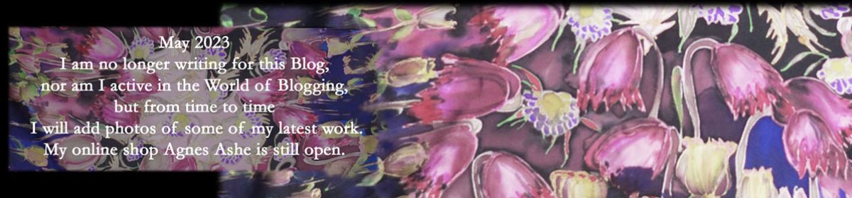
 At the moment I am painting another scarf inspired by the Tudor bows seen in the stained glass from St Edmundsbury Cathedral, Bury St Edmunds. However, this time I’ve taken the bow motif and, with spring in the air, used some lighter spring pinks and greens.


Strangely, it was seeing this art nouveau ceramic tile that was the final push to make me mix up these seedtime colours.


Lovely. I like the color combination. Different from what is so often seen. And the lovely sweeping lines you have used. Just great.
Thank you – I’m enjoying this one!
Yes, I agree. Those lovely washed pink and green tones work so well together. I have a couple of similar tiles found in a junk shop – green and cream with just a small detail in ochre. That’s good too.
Oh yes I think I mostly prefer cream rather than white with old tiles except for the ‘Delft’ look.
the colours are beautiful ! What kind of paint are you using ?
I use acid dyes that bind with the silk during two hours steaming. This process ensures the finished silk is soft and falls naturally and the colours are colour-fast. The resist (the drawing lines) is then washed out in cold water after steaming, but leaves the dye bound to the silk. I mostly paint scarves, but have just received a commission to paint/dye silk chiffon for a Prom dress.
will you post a picture once it’s done ? I’m curious to see the result ?
I quite often post a pic of finished work, but there’s several weeks time lag as I only steam in batches of six and as each scarf takes a week or so . . . perhaps April. Thanks for your interest. 🙂
Oh i see ! I can wait, don’t worry 😉
Oh this looks another beauty! It looks longer than usual or is that an illusion in that last shot.
Mmm longer than recent Ranworth twills, but same length as my crepe de chines, although narrower and therefore, yes, you are right in a way a kind of illusion. How observant of you 🙂